European Silverlight Hosting BLOG

BLOG about Latest Silverlight Hosting and Its Techologies - Dedicated to European Windows Hosting Customer

Silverlight 6 Hosting - HostForLIFE :: Graphics Path in Silverlight

clock March 1, 2024 07:54 by author Peter

Working with Path in Silverlight
A graphics path is a collection of connected lines, curves, and other basic graphic elements. This article explains how to utilize Path control in Silverlight with XAML and C#.

A graphics path is a collection of connected lines, curves, and other basic graphics objects including rectangles, ellipses, and text. A path functions as a single graphics object, thus any effect applied to the path affects all of its components. For example, if we draw a graphical path with a red stroke and it contains a line, a rectangle, and an ellipse, the red stroke will be applied to all three components of the path.
 
The Path object represents a path shape and creates a path. The Path object can create both closed and open pathways. A closed path is a shape with the same start and endpoints, whereas an open path has different starts and ends.
 
The Fill attribute fills the inside of an ellipse. StrokeThickness represents the width of an ellipse's outside line, whereas Stroke specifies its color.
 
The Path object's Data attribute defines a shape or group of forms in the form of Geometry.
 
The Path element represents a Silverlight path control in XAML.

<Path/>  

The code snippet in Listing 1 creates a Path and draws an arc by settings its Data property.
<Path Stroke="Black" StrokeThickness="4"   
    Data="M 80,200 A 100,50 45 1 0 100,50" /> 

The Path Syntaxes
Let us take a look at the Data attribute of the Path code used in the previous section.
<Path Stroke="Black" StrokeThickness="4"   
        Data="M 80,200 A 100,50 45 1 0 100,50" />  


As you may see from the above code snippet, the Data attribute has the letter M followed by two comma-separated numbers, letter A is followed by two comma-separated numbers, and letter O is also followed by two comma-separated numbers.

The letter M represents a move action and moves to the given point from the current point. For example, M 80,200 command moves from the current point to the point (80, 200).

  • The letter L draws a line from the current point to the specified point. For example, the L 100,200 command draws a line from the current point to the point (100, 200).
  • The letter H draws a horizontal line from the current point to the specified point towards the x-axis.
  • The letter V draws a vertical line from the current point to the specified point towards the y-axis.
  • The letter C draws a cubic Bezier curve from the current point to the third point and two points in between are used as the control points.
  • The letter S draws a smooth cubic Bezier curve from the current point to the second point and the first point is used as the control point.
  • The letter Q draws a quadratic Bezier curve from the first point to the second point and the first point is used as the control point.
  • The letter T draws a smooth quadratic Bezier curve from the first point to the second point and the first point is used as the control point.
  • The letter A draws an elliptical arc. It takes five parameters -  Size, IsLargeArc, Rotation Angle, Sweep Direction, and Endpoint.
  •  The letter Z closes the current path by drawing a line from the current point to the starting point.

Using Geometries within a Path
The LineGeometry class represents the geometry of a line. The StartPoint and EndPoint properties of the LineGeometry class define the start and endpoints of a line. The following code snippet creates the geometry of a line.
<LineGeometry StartPoint="20,50" EndPoint="200,50" />  

The RectangleGeometry class represents the geometry of a rectangle. The Rect property of the RectangleGeometry defines the starting points, width, and height of a rectangle. The following code snippet creates the geometry of a rectangle.
<RectangleGeometry Rect="80,167 150 30"/>  

The EllipseGeometry class represents the geometry of an ellipse. The Center property of the EllipseGeometry defines the center of an ellipse. The RadiusX and RadiusY define the width and height of an ellipse. The following code snippet creates the geometry of an ellipse.
<EllipseGeometry Center="80,150" RadiusX="50" RadiusY="50" />  

The GeometryGroup creates a composite geometry that is a combination of multiple Geometry objects.

The code listed in Listing 2 creates a GeometryGroup with three geometry shapes - a line, an ellipse, and a rectangle and sets the Data property of a path.
<Path Stroke="Black" StrokeThickness="3" Fill="Blue" >  
    <Path.Data>  
        <GeometryGroup >  
            <LineGeometry StartPoint="20,200" EndPoint="300,200" />  
            <EllipseGeometry Center="80,150" RadiusX="50" RadiusY="50" />  
            <RectangleGeometry Rect="80,167 150 30"/>  
        </GeometryGroup>  
    </Path.Data>  
</Path>  


The output of Listing 2 looks like Figure 2

The FillRule attribute of the GeometryGroup class determines how the intersecting areas of geometry objects in a GeometryGroup are mixed. It has two values: EvenOdd and Nonzero.  The FillRule's default value is EvenOdd. In this situation, the area where two shapes overlap is not filled. In the case of NonZero, the interesting space between two shapes is filled. Figure 3 is generated by adjusting the FillRule to nonzero.

Create a Path Dynamically
The code listed in Listing 3 creates Figure 2 dynamically. As you can see from Listing 3, we create a LineGeometry, an EllipseGeometry, and a RectangleGeometry and then we create a GroupGeometry and add all three geometries to the GroupGeometry. After that, we simply set the Data property of Path to the GroupGeometry.
    /// <summary>  
    /// Creates a blue path with black stroke  
    /// </summary>  
    public void CreateAPath() {  
        // Create a blue and a black Brush  
        SolidColorBrush blueBrush = new SolidColorBrush();  
        blueBrush.Color = Colors.Blue;  
        SolidColorBrush blackBrush = new SolidColorBrush();  
        blackBrush.Color = Colors.Black;  
      
        // Create a Path with black brush and blue fill  
        Path bluePath = new Path();  
        bluePath.Stroke = blackBrush;  
        bluePath.StrokeThickness = 3;  
        bluePath.Fill = blueBrush;  
      
        // Create a line geometry  
        LineGeometry blackLineGeometry = new LineGeometry();  
        blackLineGeometry.StartPoint = new Point(20, 200);  
        blackLineGeometry.EndPoint = new Point(300, 200);  
      
        // Create an ellipse geometry  
        EllipseGeometry blackEllipseGeometry = new EllipseGeometry();  
        blackEllipseGeometry.Center = new Point(80, 150);  
        blackEllipseGeometry.RadiusX = 50;  
        blackEllipseGeometry.RadiusY = 50;  
      
        // Create a rectangle geometry  
        RectangleGeometry blackRectGeometry = new RectangleGeometry();  
        Rect rct = new Rect();  
        rct.X = 80;  
        rct.Y = 167;  
        rct.Width = 150;  
        rct.Height = 30;  
        blackRectGeometry.Rect = rct;  
      
        // Add all the geometries to a GeometryGroup.  
        GeometryGroup blueGeometryGroup = new GeometryGroup();  
        blueGeometryGroup.Children.Add(blackLineGeometry);  
        blueGeometryGroup.Children.Add(blackEllipseGeometry);  
        blueGeometryGroup.Children.Add(blackRectGeometry);  
      
        // Set Path.Data  
        bluePath.Data = blueGeometryGroup;  
      
        LayoutRoot.Children.Add(bluePath);  
    }  


If we need to generate a single geometry, we do not need to use a GeometryGroup. We can simply set geometry as the Data of the Path. The following code snippet sets an EllipseGeometry as the Data property of a Path.
    <Path Stroke="Black" StrokeThickness="3" Fill="Blue" >  
        <Path.Data>              
                <EllipseGeometry Center="80,150" RadiusX="50" RadiusY="50" />  
       </Path.Data>  
    </Path>  

Formatting a Path
We can use the Fill property of the Path to draw a Path with any kind of brush including a solid brush, linear gradient brush, radial-gradient brush, or an image brush. The code in Listing 4 uses linear gradient brushes to draw the background and foreground of a Path.
    <Path Stroke="Black" StrokeThickness="3">  
        <Path.Data>  
            <GeometryGroup>  
                <LineGeometry StartPoint="20,200" EndPoint="300,200" />  
                <EllipseGeometry Center="80,150" RadiusX="50" RadiusY="50" />  
                <RectangleGeometry Rect="80,167 150 30" />  
            </GeometryGroup>  
        </Path.Data>  
        <Path.Fill>  
            <LinearGradientBrush StartPoint="0,0" EndPoint="1,1">  
                <GradientStop Color="Blue" Offset="0.25" />  
                <GradientStop Color="Orange" Offset="0.50" />  
                <GradientStop Color="Green" Offset="0.65" />  
                <GradientStop Color="Red" Offset="0.80" />  
            </LinearGradientBrush>  
        </Path.Fill>  
    </Path> 


The new Path looks like Figure 4.

Setting Image as Background of a Path
To set an image as the background of a Path, we can set an image brush as the Fill of the Path. The code in Listing 5 sets fills the Path with an image.  
    <Path.Fill >  
        <ImageBrush ImageSource="dock.jpg" />  
    </Path.Fill > 


The new output looks like Figure 5.

 
Drawing a Semi-transparent Path
The Opacity property represents the transparency of a Path. The value of Opacity is between 0 and 1, where 0 is fully transparent and 1 is fully opaque. The code listed in Listing 6 generates a semi-transparent shape.
<Path Stroke="Black" StrokeThickness="3" Opacity="0.5" />  

The new output looks like Figure 5.


Silvelight 6 Hosting - HostForLIFE :: Working with DataGrid in Silverlight

clock March 31, 2023 07:46 by author Peter

Silverlight DataGrid Control
This article shows you how to work with a DataGrid control available in Silverlight 2.0. The article also demonstrates some formatting and data binding techniques.

Introduction
The DataGrid tag represents a Silverlight DataGrid control in XAML.  The DataGrid control is found in System.Windows.Controls namespace. When you drag and drop a DataGrid control from Toolbox to your XAML code, the action adds the following tag for the DataGrid control.
<my:DataGrid></my:DataGrid>  

And at the top of the XAML file, the designer adds the following line that adds a namespace System.Windows.Controls and assembly reference to System.Windows.Controls.Data.
xmlns:my="clr-namespace:System.Windows.Controls;assembly=System.Windows.Controls.Data"  

The Width and Height attributes represent the width and height of a DataGrid.  The x: Name attribute represents the name of the control, which is a unique identifier of a control.  The Margin attribute sets the margin of the DataGrid being displayed from the top left corner.
 
The following code snippet sets the name, height, width, and margin of a DataGrid control.
    < my: DataGrid x: Name = "McDataGrid"  
    Width = "400"  
    Height = "300"  
    Margin = "10,10,10,10" > </my:DataGrid>  

Another way to create a DataGrid control is by dragging a DataGrid control from Toolbox to the XAML code in Visual Studio XAML editor.  Once you drag and drop a DataGrid control to the XAML page, you will see the following namespace reference is added to the XAML code.
xmlns:data="clr-namespace:System.Windows.Controls;assembly=System.Windows.Controls.Data"    

And the following code is added to the XAML code for the DataGrid.
<data:DataGrid></data:DataGrid>  

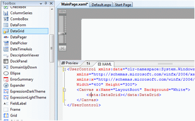
Figure 1 shows Toolbox and XAML code preview after a DataGrid is added to a page.

Data Binding
The ItemSource property of DataGrid is the key to data binding. You can bind any data source that implements IEnuemerable. Each row in the DataGrid is bound to an object in the data source and each column in the DataGrid is bound to a property of the data source objects.
 
Listing 1 sets the ItemsSource property of a DataGrid to an array of strings.
    public MainPage() {  
      InitializeComponent();  
      McDataGrid.ItemsSource = LoadStringData();  
    }  
      
    /// <summary>  
    /// Load a string collection  
    /// </summary>  
    /// <returns></returns>  
    private string[] LoadStringData() {  
      return "One Two Three Four Five Six Seven Eight".Split();  
    }

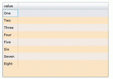
Figure 2 is the result of Listing 1. As you may see from Listing 1, the default column of the DataGrid shows all the strings in the array.

This was a simple example. Now let's build a little complex example.
 
ItemsSource and Data Binding
In this example, we will create a collection of objects and bind it to a DataGrid control.
 
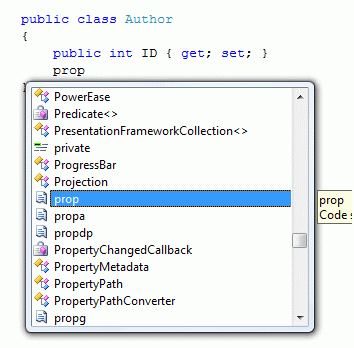
First, we are going to add a class to the project. Right click on the project, select Add New Item and select Class. I give my class name Author.cs. After that, we are going to add some public properties to the class. The simplest way to add a property to a class is type "prop" and hit TAB twice. This action will add an automatic property to the class. See Figure 3.

The final Author class looks like Listing 2.
    public class Author {  
      public int ID {  
        get;  
        set;  
      }  
      public string Name {  
        get;  
        set;  
      }  
      public DateTime DOB {  
        get;  
        set;  
      }  
      public string BookTitle {  
        get;  
        set;  
      }  
      public bool IsMVP {  
        get;  
        set;  
      }  
    }


Now let's create a collection of Author objects by using the List class. The LoadCollectionData method in Listing 3 creates a List of Author objects.
     /// <summary>  
    /// List of Authors  
    /// </summary>  
    /// <returns></returns>  
    private List<Author> LoadCollectionData()  
    {  
        List<Author> authors = new List<Author>();  
        authors.Add(new Author(){  
                ID = 101,  
                Name = "Peter",  
                BookTitle = "Graphics Programming with GDI+",  
                DOB = new DateTime(1975, 2, 23),  
                IsMVP = false });  
        authors.Add(new Author()  
        {  
            ID = 201,  
            Name = "Scott",  
            BookTitle = "Programming C#",  
            DOB = new DateTime(1982, 4, 12),  
            IsMVP = true  
        });  
        authors.Add(new Author()  
        {  
            ID = 244,  
            Name = "Mark",  
            BookTitle = "LINQ in Vista",  
            DOB = new DateTime(1985, 9, 11),  
            IsMVP = true  
        });  
        return authors;  
    }  


The following code snippet sets the ItemsSource property of a DataGrid to List of Authors.
    McDataGrid.ItemsSource = LoadCollectionData();  


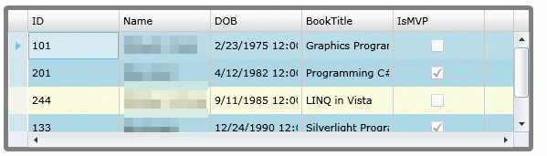
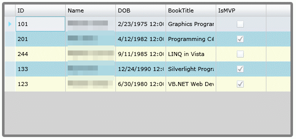
The new DataGrid looks like Figure 4, which shows the properties of the Author class column names.

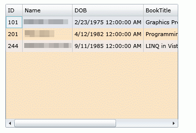
As you saw in Figure 4, all public properties of the Author object are represented as columns of the DataGrid. This is because by default, the AutoGenerateColumns property of DataGrid is true. If you do not wish to generate automatic columns, you simply need to set this property to false.
McDataGrid.AutoGenerateColumns = false;  

Setting Column Width and Row Height
The ColumnWidth and RowHeight properties of DataGrid are used to set the default column width and row height of DataGrid columns and rows.
 
The following code snippet sets column width and row height to 100 and 40 respectively.
 <data:DataGrid x:Name="McDataGrid" Width="580" Height="270"  
                   Margin="10,10,0,0" Background="Bisque"  
                   ColumnWidth="100" RowHeight="40">             
         
    </data:DataGrid>  

The new DataGrid looks like Figure 5.

The MaxWidth and MaxHeight properties represent the maximum width and maximum height of a DataGrid.  The MinWidth and MinHeight properties represent the minimum width and maximum height of a DataGrid. The MaxColumnWidth and MinColumnWidth properties represent the maximum width and minimum width of columns in a DataGrid.
 
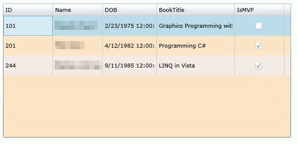
Grid Lines Visibility and Header Visibility
The GridLinesVisibility property is used to make gridlines visible. Using this option you can show and hide vertical, horizontal, all, or none lines.  The HeaderVisibility property is used to show and hide row and column headers.
 
The following code snippet makes vertical grid lines visible and header visible for both rows and columns.
GridLinesVisibility="Vertical" HeadersVisibility="All"

The new DataGrid looks like Figure 6.


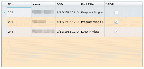
Grid Background, Row Background, and Alternative Row Background
The Background property is used to set the background color of the DataGrid. The RowBackground and AlternativeRowBackground properties are used to set the background color of rows and alternative of the DataGrid.
 
The following code snippet sets the background, row background, and alternative row background colors of a DataGrid.
Background="LightGray" RowBackground="LightYellow"
AlternatingRowBackground="LightBlue"  

The new DataGrid looks like Figure 7.


Border Color and Thickness
The BorderBrush and BorderThickness properties are used to set the color and width of the border. The following code snippet sets border color to gray and thickness to 5.
BorderBrush="Gray" BorderThickness="5"  

The DataGrid with a new border looks like Figure 8.
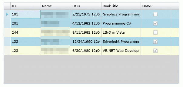
Sorting
By default, column sorting is enabled on a DataGrid. You can sort a column by simply clicking on the column header.  You may disable this feature by setting CanUserSortColumns property to false. The following code snippet sets CanUserSortColumns properties to false.
CanUserSortColumns = "False"  

Scrolling
The HorizontalScrollBarVisibility and VerticalScrollBarVisibility properties of type ScrollBarVisibility enumeration control the horizontal and vertical scrollbars of the DataGrid. It has four values - Auto, Disabled, Hidden, and Visible. The default value of these properties is Auto, that means, when scrolling is needed, you will see it, otherwise it will be hidden.
 
The following code snippet enables horizontal and vertical scrollbars.
    HorizontalScrollBarVisibility="Visible"  
    VerticalScrollBarVisibility="Visible"  


The DataGrid with both scrollbars looks like Figure 9.


Silvelight 6 Hosting - HostForLIFE :: CheckBox in Silverlight

clock January 11, 2023 07:48 by author Peter

Silverlight CheckBox Control

This article demonstrates how to create and use a CheckBox control in Silverlight with the help of XAML and C#.

Creating a CheckBox

The CheckBox element represents a Silverlight CheckBox control in XAML.


<CheckBox/>


The Content attribute represents the text of a CheckBox.  The x:Name attribute represents the name of the control, which is a unique identifier of a control. The code snippet in Listing 1 creates a CheckBox control and sets the name and content of a CheckBox control.


<CheckBox x:Name="McCheckBox"

          Canvas.Left="10" Canvas.Top="10"

          Content="Check Me" >            

</CheckBox>

The output looks like Figure 1.

The IsChecked property represents the state of the CheckBox control. The IsThreeState property represents whether the CheckBox has two or three states. Three states are checked, unchecked, or indeterminate.  The code snippet in Listing 2 sets IsChecked and IsThreeState properties of the CheckBox.

<CheckBox x:Name="McCheckBox"

          Canvas.Left="10" Canvas.Top="10"

          Content="Check Me"

          IsChecked="True" IsThreeState="True" >            

</CheckBox>

Listing 2

Adding a CheckBox Click Event Handler

The Checked and Unchecked attributes of the CheckBox element adds the checked and unchecked event handler. These events are fired when a CheckBox state is changed to checked and unchecked respectively. The code in Listing 3 adds these two event handlers.

<CheckBox x:Name="McCheckBox"

          Canvas.Left="10" Canvas.Top="10"

          Content="Check Me"

          IsChecked="True" IsThreeState="True"

          Checked="McCheckBox_Checked" Unchecked="McCheckBox_Unchecked">            

</CheckBox>

Listing 3

The code for the click event handler looks like following.

private void McCheckBox_Checked(object sender, RoutedEventArgs e)

{

}


private void McCheckBox_Unchecked(object sender, RoutedEventArgs e)

{

}

The code listed in Listing 4 sets a TextBox text on both checked and unchecked events.

private void McCheckBox_Checked(object sender, RoutedEventArgs e)

{

    McTextBox.Text = "Checked";

}


private void McCheckBox_Unchecked(object sender, RoutedEventArgs e)

{

    McTextBox.Text = "Unchecked";

}

Listing 4

Creating a CheckBox Dynamically

The code listed in Listing 5 creates a CheckBox control programmatically. First, it creates a CheckBox object and sets its width, height, contents, background and foreground and later the CheckBox is added to the LayoutRoot.

private void CreateDynamicCheckBox()

{

    CheckBox chb = new CheckBox();

    chb.Content = "Click me";

    chb.IsChecked  = true;


    LayoutRoot.Children.Add(chb);

}

Listing 5

Summary
In this article, I discussed how we can create a CheckBox control in Silverlight at design-time using XAML and at run-time using C#.


Silvelight 6 Hosting - HostForLIFE :: File Upload in Silverlight

clock November 29, 2022 06:56 by author Peter

In this article, I will discuss how you can create your own File Upload feature in a Silverlight application.

Step 1
First, create a Silverlight Web application in Visual Studio 2008. You will see your default Page.xaml.
 
Step 2
On Create Page.xaml, change your code by adding the following Panel, Button, and TextBlock controls.
On the button click event handler, I write code to call the OpenFileDialog that allows us to browse files and gives us the selected file name. Here is the code.
    public void Button_Click(object sender, RoutedEventArgs e) { 
      OpenFileDialog dlg = new OpenFileDialog(); 
      dlg.Multiselect = false; 
      dlg.Filter = "All files (*.*)|*.*|PNG Images (*.png)|*.png"; 
      bool ? retval = dlg.ShowDialog(); 
      if (retval != null && retval == true) { 
        UploadFile(dlg.File.Name, dlg.File.OpenRead()); 
        StatusText.Text = dlg.File.Name; 
      } 
      else { 
        StatusText.Text = "No file selected..."; 
      } 
    }

As you can see from the above code, I call a method UploadFile by passing the selected file name from the OpenFileDialog.
 
The UploadFile method looks like the following. In this code, I use a WebClient class and a PushData method.
    private void UploadFile(string fileName, Stream data) 
            { 
                UriBuilder ub = new UriBuilder("http://localhost:3840/receiver.ashx"); 
                ub.Query = string.Format("filename={0}", fileName); 
                WebClient c = new WebClient(); 
                c.OpenWriteCompleted += (sender, e) => 
                { 
                    PushData(data, e.Result); 
                    e.Result.Close(); 
                    data.Close(); 
                }; 
                c.OpenWriteAsync(ub.Uri); 
            } 
            private void PushData(Stream input, Stream output) 
            { 
                byte[] buffer = new byte[4096]; 
                int bytesRead; 
                while ((bytesRead = input.Read(buffer, 0, buffer.Length)) != 0) 
                { 
                    output.Write(buffer, 0, bytesRead); 
                } 
            }

Step 3
Add a new Generic Handler receiver.ashx.
Now let's add a class. Right-click on the project and add a new item by selecting Generic Handler in the right side templates as shown below.

And add the following code on the code behind-
    <%@ WebHandler Language="C#" Class="receiver" %> 
     
    using System; 
    using System.Web; 
    using System.IO; 
    public class receiver : IHttpHandler { 
           public void ProcessRequest (HttpContext context) { 
            string filename = context.Request.QueryString["filename"].ToString(); 
            using (FileStream fs = File.Create(context.Server.MapPath("~/App_Data/" + filename))) 
            { 
                SaveFile(context.Request.InputStream, fs); 
            } 
        } 
        private void SaveFile(Stream stream, FileStream fs) 
        { 
            byte[] buffer = new byte[4096]; 
            int bytesRead; 
            while ((bytesRead = stream.Read(buffer, 0, buffer.Length)) != 0) 
            { 
                fs.Write(buffer, 0, bytesRead); 
            } 
        } 
      
        public bool IsReusable { 
            get { 
                return false; 
            } 
        } 
    }


Step 4
Build and Run
That's all. You are done. Now just build and run your project.
When you click the Select File button, you will see Browse files dialog that lets you browse the files.

Note
You need to make sure your folder on the Web has to write permissions to upload files.
 
Summary
In this article, we learned about File Upload in Silverlight with an example.


European Silverlight 6 Hosting - Nederland :: Silverlight 5 Viewbox Control

clock March 15, 2019 09:45 by author Peter

This article will explore how to use the ViewBox control in Silverlight 6. The ViewBox control allows you to place a child control such as Image within it in such a way that it will be scaled appropriately to fit the available without any distortion. It is typically used in 2D graphics.

We will begin with creating a new Silverlight 6 project. Modify the existing XAML code of MainPage.xaml so that a Grid of 1 column and three rows is created. The code for the same is shown below:

<UserControl x:Class="SilverlightDemo.MainPage"
    xmlns="http://schemas.microsoft.com/winfx/2006/xaml/presentation"
    xmlns:x="http://schemas.microsoft.com/winfx/2006/xaml"
    xmlns:d="http://schemas.microsoft.com/expression/blend/2008"
    xmlns:mc=http://schemas.openxmlformats.org/markup-compatibility/2006 mc:Ignorable="d" xmlns:sdk=http://schemas.microsoft.com/winfx/2006/xaml/presentation/ sdk HorizontalAlignment="Stretch" VerticalAlignment="Stretch">
    <Grid x:Name="LayoutRoot" Background="White" Height="300" Width="300">
        <Grid.ColumnDefinitions>
            <ColumnDefinition Width="200" />
        </Grid.ColumnDefinitions>
        <Grid.RowDefinitions>
            <RowDefinition Height="Auto" />
            <RowDefinition Height="Auto" />
            <RowDefinition Height="Auto" />
        </Grid.RowDefinitions>
    </Grid>
</UserControl>

Drag and drop the Viewbox control from the Toolbox into the XAML code between the <Grid></Grid> tags. Specify its row and column in the grid to be 0. The resulting code is seen below.

<UserControl x:Class="SilverlightDemo.MainPage"
    xmlns="http://schemas.microsoft.com/winfx/2006/xaml/presentation"
    xmlns:x="http://schemas.microsoft.com/winfx/2006/xaml"
    xmlns:d="http://schemas.microsoft.com/expression/blend/2008"
    xmlns:mc=http://schemas.openxmlformats.org/markup-compatibility/2006 mc:Ignorable="d" xmlns:sdk=http://schemas.microsoft.com/winfx/2006/xaml/presentation/ sdk HorizontalAlignment="Stretch" VerticalAlignment="Stretch">        <Grid.ColumnDefinitions>
            <ColumnDefinition Width="200" />
        </Grid.ColumnDefinitions>
        <Grid.RowDefinitions>
            <RowDefinition Height="Auto" />
            <RowDefinition Height="Auto" />
            <RowDefinition Height="Auto" />
        </Grid.RowDefinitions>
         <controls:Viewbox Grid.Row="0" Grid.Column="0" Height="120" Width="120">
  </controls:Viewbox
    </Grid>
</UserControl>

Right click on the project name in the Solution Explorer pane and select Add Existing Item option. Choose the image "Winter.jg" from the My Documents\My Pictures\Sample Pictures folder.

Drag and drop an Image control in between the <controls:ViewBox> and </controls:ViewBox> tag and modify its code as shown below, to specify its source and size.

    <Grid x:Name="LayoutRoot" Background="White" Height="300" Width="300">
        <Grid.ColumnDefinitions>
            <ColumnDefinition Width="200" />
        </Grid.ColumnDefinitions>
        <Grid.RowDefinitions>
            <RowDefinition Height="Auto" />
            <RowDefinition Height="Auto" />
            <RowDefinition Height="Auto" />
        </Grid.RowDefinitions>
         <controls:Viewbox Grid.Row="0" Grid.Column="0" Height="120" Width="120">
            <Image Source="Winter.jpg" Height="40" Width="40"></Image>
        </controls:Viewbox>
    </Grid>

Drag and drop another ViewBox and then an Image control in between the second <controls:ViewBox> and </controls:ViewBox> tag.

Modify the XAML as shown below:

    <Grid x:Name="LayoutRoot" Background="White" Height="300" Width="300">
        <Grid.ColumnDefinitions>
            <ColumnDefinition Width="200" />
        </Grid.ColumnDefinitions>
        <Grid.RowDefinitions>
            <RowDefinition Height="Auto" />
            <RowDefinition Height="Auto" />
            <RowDefinition Height="Auto" />
        </Grid.RowDefinitions>
         <controls:Viewbox Grid.Row="0" Grid.Column="0" Height="120" Width="120">
            <Image Source="Winter.jpg" Height="40" Width="40"></Image>
        </controls:Viewbox>
<controls:Viewbox Grid.Row="1" Grid.Column="0" Height="70" Width="90">
    <Image Source="Winter.jpg" Height="40" Width="40"></Image></controls:Viewbox
    </Grid>

Save the solution, build and execute it. When you see the output, you will observe that the two images show no distortion whatsoever though their height and width are not the same. This has happened because of the ViewBox.

HostForLIFE.eu Silverlight 6 Hosting
HostForLIFE.eu is European Windows Hosting Provider which focuses on Windows Platform only. We deliver on-demand hosting solutions including Shared hosting, Reseller Hosting, Cloud Hosting, Dedicated Servers, and IT as a Service for companies of all sizes. We have customers from around the globe, spread across every continent. We serve the hosting needs of the business and professional, government and nonprofit, entertainment and personal use market segments.


European Silverlight 6 Hosting - HostForLIFE.eu :: Tic Tac Toe, Silverlight Drawing Basics

clock August 16, 2018 11:32 by author Peter

Silverlight is being on high recognition in the industry and it is really cool! In this article I am trying to create a marker control that allows the user to mark certain areas on the image canvas.  This will work as the drawing board for our Tic Tac Toe game.  We can see the usage of Canvas and its Children property applied with the Line class.

The application provides with a layer of buttons on choosing the pen, eraser or the color selector.  The board is represented by a Canvas class.

Canvas
In this application, the Canvas instance serves as our main drawing board.  The canvas is named BoardCanvas.  The drawings over the canvas are captured as Line objects and added to the Children property of the canvas.  The Children property accepts of type UIElement.

Line
The Line instances are used whenever the user marks over the board.  For each stroke a number of line objects are created to represent the stroke.  The user can choose two colors from the screen.
Repeating  that the line objects are created and added to the Children property of the canvas.

Delete
The delete functionality allows the user to delete the line under mouse cursor position.  This helps the user to remove an unwanted line.

The functionality is implemented by taking the mouse X, Y position and parsing through the line collection.  Each line's X, Y will be checked with the mouse positions and if a match found, the line is deleted from the canvas object.

Clear
There is a Clear button on the screen that will clear the board canvas. This will quickly help the user to restart the game.

The functionality is implemented by clearing all the lines from the canvas Children property.

Functionality Explained

The enumeration Mode is used to represent the active drawing mode of the application.  When the application starts, the default mode will be Draw.
public enum Mode
{
    None,
    Draw,
    Delete
}

When the user presses the Pen button, the mode will be set to Draw.

private void PenButton_Click(object sender, RoutedEventArgs e)
{
    _mode = Mode.Draw;
}


When the user presses the Delete button, the mode will be set to Delete.
private void Delete_Click(object sender, RoutedEventArgs e)
{
    _mode = Mode.Erase;
}

When the user presses, the Clear button, there is no mode change – the ClearAll() method is called.  The ClearAll() method will clear the Children property of the canvas and resets the mode to Draw. There is a private variable _lines which is used to hold all the lines of the drawing.
private void ClearAll()
{
    foreach (Line line in _lines)
        BoardCanvas.Children.Remove(line);
    _lines.Clear();
    _mode = Mode.Draw;
}


European Silverlight 6 Hosting - HostForLIFE.eu :: Creating a Beautiful Splash Screen For Silverlight Applications

clock July 26, 2018 08:18 by author Peter

There are many other great articles and blog posts on how to create simple Silverlight Splash Screens. This article adds on top of them and helps you design a more complex splash screen with Story Boards and Floating Text Blocks. I am not a great designer and thus I am taking a design que from Telerik's Silverlight Demos splash screen. They have some amazing designers and their splash screen is an amazing example of that. If you have not already noticed it please visit http://demos.telerik.com/silverlight/ and have a look yourself. We will try to replicate the same behavior in our splash screen. Here is a step-by-step guide to do this.

1. Create your XAML
In order to add the splash screen you will first need to add a new Silverlight 1.0 JavaScript (we will refer to it as SLJS for the sake of writing simplicity) page on your server side code.

Since you cannot modify this file in Blend, I created a new Silverlight project and created a new Silverlight User control in it.
Once I had completed the design of this page in Blend, I copied the content to the Silverlight JS page on the server side.
I had to make a few modifications that are listed below.

  • First delete the x:class namespace as that is not supported on a SLJS page
  • Also delete the underlying code file (in my case it was SplashScreen.xaml.cs)
  • I added a storyboard animation to float the text from left to right

<Grid.Resources>
  <Storyboardx:Name="sb1"RepeatBehavior="1x"Completed="onCompleted">
    <DoubleAnimationDuration="0:0:5"To="255"
    Storyboard.TargetProperty="X"Storyboard.TargetName="myTranslate"d:IsOptimized="True"/>
  </Storyboard>
</Grid.Resources>

 
Based on your design, the following content may change (I designed it to match the same as Telerik's splash page):
<Grid Background="#FFF4F4F4" RenderTransformOrigin="0.5,0.5"> <Grid.RowDefinitions> <RowDefinition Height="120"/> <RowDefinition Height="32"/> <RowDefinition Height="8"/> <RowDefinition Height="20"/>
 <RowDefinition Height="375*"/> </Grid.RowDefinitions> <TextBlock HorizontalAlignment="Left" TextWrapping="Wrap" Grid.Row="0" Text="Silverlight" VerticalAlignment="Top" Height="153" Width="806" FontSize="133.333"
Foreground="#FFEEEEEE" Grid.RowSpan="3"/> <!--<StackPanel Orientation="Horizontal" Grid.Row="1" Margin="100,0,0,0" >
<Image Source="/Content/np_logo.PNG" Margin="0,0,5,0" Width="32" />
<TextBlock Text="Netpractise" FontSize="26.667" Foreground="Black"  FontFamily="Moire Light" x:Name="editing" FontWeight="ExtraBold" Height="32"/>
</StackPanel>--> <Image Source="/Content/np.PNG" Grid.Row="1" Margin="100,0,0,0" HorizontalAlignment="Left" /> <Rectangle Height="5" Fill="#FFA0DA0A" Width="200" HorizontalAlignment="Left"  Margin="100,0,0,0"
Grid.Row="2"/> <!--<TextBlock Text="digital communication innovation" Loaded="onTextBoxDigitalLoaded" Margin="100,0,0,0"  HorizontalAlignment="Left" FontFamily="Moire" FontSize="13.333" Height="16" Grid.Row="3"/>-->
<Image Source="/Content/baseline.PNG"  Margin="100,0,0,0" Width="300"  HorizontalAlignment="Left" Grid.Row="3"/> <!-- Progress bar--> <Rectangle Fill="#FF24A9F3" Height="5" HorizontalAlignment="Left" x:Name="uxProgress"
Grid.Row="2"/> <!--floating text boxes--> <TextBlock x:Name="textBlock" HorizontalAlignment="Left" TextWrapping="Wrap" Text="Be it Videos, Images, Flash or Audio we support all."
VerticalAlignment="Center" Grid.Row="4" Height="400"
Width="510" Foreground="#FF24A9F3" FontSize="48" FontFamily="Segoe WP Light" RenderTransformOrigin="0.5,0.5"
Loaded="onTextBoxLoaded" Margin="20,0,0,0"> <TextBlock.RenderTransform> <TransformGroup> <TranslateTransform x:Name="myTranslate"/> </TransformGroup> </TextBlock.RenderTransform> <!--The story board can be placed
within this to run from XAML or JS functions can be used.--> <!--<TextBlock.Triggers>
<EventTrigger RoutedEvent="TextBlock.Loaded">
<BeginStoryboard>
</BeginStoryboard>
</EventTrigger>               
</TextBlock.Triggers>--> </TextBlock> <TextBlock x:Name="txtProgressPercentage" Grid.Row="4" HorizontalAlignment="Right" Margin="0,-150,-170,0" VerticalAlignment="Center" TextWrapping="Wrap" Height="358" Width="651"
FontSize="300" Foreground="#FFE4E4E4"/> </Grid>


2. Code the logic in JavaScript file
When you add a new SLJS page in your application, it also creates an underlying .js file where you can write your code logic.
All I had to do was to create 3 functions in it ; they are:

onSourceDownloadProgressChanged

This is to update the progress bar and the big textblock that shows % update in numbers.
var i = 0;
function onSourceDownloadProgressChanged(sender, eventArgs)
{
sender.findName("txtProgressPercentage").Text = Math.round(Math.round((eventArgs.progress * 1000)) / 10, 1).toString();
//get browser width   var width = window.document.body.clientWidth;
sender.findName("uxProgress").Width = (width * eventArgs.progress);
}
 

onTextBoxLoaded
This is to trigger the first story board.
function onTextBoxLoaded(sender, eventArgs)
{
// Retrieve the Storyboard and begin it.     sender.findName("sb1").begin();
}


onCompleted
This is to change the Text of the floating Text box and start the Storyboard again with updated text.
function onCompleted(sender, eventArgs)
{
try{
i++;
sender.findName("myTranslate").X = 0;
switch (i) {
case 1:
sender.findName("textBlock").Text = "This is my first content";
break;
case 2:
sender.findName("textBlock").Text = "This is my second content";
break;
case 3:
sender.findName("textBlock").Text = "This is my third content.";
break;
case 4:
sender.findName("textBlock").Text = "This is my fourth content";
break;
case 5:
sender.findName("textBlock").Text = "This is my fifth content.";
break;
case 6:
sender.findName("textBlock").Text = "This is my sixth content";
i = 1;
break;
}
}catch(e){
}
sender.findName("sb1").begin();


I have 6 text block contents that show up on the screen one by one. You can have as many as you want and can also pull them from a collection if that's what you need.

3. Updating the Default.html or Default.aspx page
This is an important and the last step to hook the splash screen we created to our Silverlight application.
Just add a few parameters and a link to the JavaScript file just below the </head> tag.
<script type="text/javascript" src="splashscreen.js"></script>

The following new parameters go in <div id="silverlightControlHost">:
<param name="splashscreensource" value="SplashScreen.xaml" /> <param name="onSourceDownloadProgressChanged" value="onSourceDownloadProgressChanged" />

The first parameter just tells your app which splash screen to load at startup and the second one calls the js function that eventually updates the progress bar and % progress textblock with numbers.


European Silverlight 6 Hosting - HostForLIFE.eu :: Update Data Using Silverlight RIA Enabled ServiceToday

clock July 10, 2018 11:28 by author Peter

Update Data Using Silverlight RIA Enabled ServiceToday, in this article let's play around with one of the interesting and most useful concepts in Silverlight.

Question: What is update data using Silverlight RIA enabled service?
In simple terms "This application enables to update the data in the database with help of Silverlight RIA enabled service. It uses base platform of entity framework to communicate with database".

Step 1: Create a database named "Company" with employee table in it.

Step 2: Open up Visual Studio and create a new Silverlight application enabled with RIA Services
Step 3: When the project is created. Right-click on RIA Service project and add new entity data model framework and set it up for previously created database.
Step 4: Again right click on RIA service project and add Domain Service Class as new item.
Step 5: Complete code of EmployeeDomain.cs looks like this (Domain Service Class)
namespace SilverlightRIAInsert.Web
{
using System;
using System.Collections.Generic;
using System.ComponentModel;
using System.ComponentModel.DataAnnotations;
using System.Data;
using System.Linq;
using System.ServiceModel.DomainServices.EntityFramework;
using System.ServiceModel.DomainServices.Hosting;
using System.ServiceModel.DomainServices.Server;
// Implements application logic using the CompanyEntities context.
// TODO: Add your application logic to these methods or in additional methods.
// TODO: Wire up authentication (Windows/ASP.NET Forms) and uncomment the following to disable anonymous access
// Also consider adding roles to restrict access as appropriate.
// [RequiresAuthentication][EnableClientAccess()]
public class EmployeeDomain : LinqToEntitiesDomainService<CompanyEntities>
{
    // TODO:// Consider constraining the results of your query method.  If you need additional input you can
    // add parameters to this method or create additional query methods with different names.
    // To support paging you will need to add ordering to the 'Employee'
    query.public IQueryable<Employee> GetEmployee()
    {
        return this.ObjectContext.Employee;
    }
    public void InsertEmployee(Employee employee)
    {
        if ((employee.EntityState != EntityState.Detached))
        {
            this.ObjectContext.ObjectStateManager.ChangeObjectState(employee, EntityState.Added);
        }
        else{this.ObjectContext.Employee.AddObject(employee);
        }
    }
    public void UpdateEmployee(Employee currentEmployee)
    {
        this.ObjectContext.Employee.AttachAsModified(currentEmployee, this.ChangeSet.GetOriginal(currentEmployee));
    }
    public void DeleteEmployee(Employee employee)
    {
        if ((employee.EntityState != EntityState.Detached))
        {
            this.ObjectContext.ObjectStateManager.ChangeObjectState(employee, EntityState.Deleted);
        }
        else{this.ObjectContext.Employee.Attach(employee);
           this.ObjectContext.Employee.DeleteObject(employee);
        }
    }
}
}


Step 6: Now rebuild the solution file.
Step 7: The complete code of MainPage.xaml looks like this:
<usercontrolx:class="SilverlightRIAInsert.MainPage"xmlns="http://schemas.microsoft.com/winfx/2006/xaml/presentation"
xmlns:x="http://schemas.microsoft.com/winfx/2006/xaml"xmlns:d="http://schemas.microsoft.com/expression/blend/2008"
xmlns:mc="http://schemas.openxmlformats.org/markup-compatibility/2006"mc:ignorable="d"
d:designheight="300"d:designwidth="543">
<Gridx:Name="LayoutRoot"Width="608">
<TextBlockHeight="23"HorizontalAlignment="Left"Margin="152,29,0,0"Name="textBlock1"Text="Id"FontFamily="Verdana"FontSize="15"VerticalAlignment="Top"/>
<TextBoxHeight="23"HorizontalAlignment="Left"Margin="252,25,0,0"Name="textBox1"VerticalAlignment="Top"Width="120"/>
<TextBlockHeight="23"HorizontalAlignment="Left"Margin="150,72,0,0"Name="textBlock2"Text="FirstName"FontFamily="Verdana"FontSize="15"VerticalAlignment="Top"/>
<TextBoxHeight="23"HorizontalAlignment="Left"Margin="252,68,0,0"Name="textBox2"VerticalAlignment="Top"Width="120"/>
<TextBlockHeight="23"HorizontalAlignment="Left"Margin="150,113,0,0"Name="textBlock3"Text="LastName"FontFamily="Verdana"FontSize="15"VerticalAlignment="Top"/>
<TextBoxHeight="23"HorizontalAlignment="Left"Margin="252,113,0,0"Name="textBox3"VerticalAlignment="Top"Width="120"/>
<ButtonContent="Update"FontFamily="Verdana"FontSize="19"Background="DeepSkyBlue"Height="44"HorizontalAlignment="Left"Margin="252,206,0,0"Name="button1"VerticalAlignment="Top"Width="120"Click="button1_Click"/>
<TextBoxHeight="23"HorizontalAlignment="Left"Margin="252,155,0,0"Name="textBox4"VerticalAlignment="Top"Width="120"/>
<TextBlockHeight="23"HorizontalAlignment="Left"Margin="152,155,0,0"Name="textBlock4"Text="Age"FontFamily="Verdana"FontSize="16"VerticalAlignment="Top"/>
</Grid>"
</usercontrol>


Step 8: The complete code of MainPage.xaml.cs looks like this:
using System;
using System.Collections.Generic;
using System.Linq;
using System.Net;
using System.ServiceModel.DomainServices.Client;
using System.Windows;
using System.Windows.Controls;
using System.Windows.Documents;
using System.Windows.Input;
using System.Windows.Media;
using System.Windows.Media.Animation;
using System.Windows.Shapes;
using SilverlightRIAUpdate.Web;
namespace SilverlightRIAUpdate
{
public partial class MainPage : UserControl
{
    public MainPage()
    {
        InitializeComponent();
    }
    EmployeeDomain objDomain = new EmployeeDomain();
    private void button1_Click(object sender, RoutedEventArgs e)
    {
        EntityQuery<Employee> query = objDomain.GetEmployeeQuery();
        objDomain.Load(query, UpdateLoad, null);
        MessageBox.Show("Data Updated Successfully");
    }
    public void UpdateLoad(LoadOperation<Employee> emp)
    {
        foreach (Employee e in objDomain.Employees)
        {
            if (e.Id == int.Parse(textBox1.Text))
           {
                e.FirstName = textBox2.Text;
                e.LastName = textBox3.Text;
                e.Age = int.Parse(textBox4.Text);
                objDomain.SubmitChanges();
                break;
            }
        }
    }
}
}


Silverlight 6 Hosting - HostForLIFE.eu :: How to Create Pop Up Notifications

clock October 15, 2015 17:11 by author Rebecca

In this post, I will tell you how to create pop up notification in Silverlight. I will separate the kinds of notification into: Alert, Prompt and Confirm popup box.

There is a class called System.Windows.Browsers that comes with Silverlight. Also, there are lots of methods to create alert, prompt and confirm box using JavaScript. Let’s look further into each notification one by one:

1. Alert

HtmlPage.Window.Alert("Alert from Silverlight screen");

Same thing can be achieved using the Silverlight MessageBox. The only difference is that in case of MessageBox, you don't have the alert symbol. But at the same time with MessageBox you have the option to display appropriate title for the pop up.

MessageBox.Show("MessageBox for Silverlight", "AlertMessageBox", MessageBoxButton.OK)

2. Confirm

HtmlPage.Window.Confirm("Do you know how to call Alert from Silverlight");

The confirm method returns bool value, this can be used to perfrom further action depending upon if user clicks OK or Cancel button. Below code display how to handle the same.

bool isConfirmed = HtmlPage.Window.Confirm("Do you know how to call Alert from Silverlight");

if (isConfirmed)

 {

   //Perform some action;

 }
This thing can also be achieved using the Silverlight MessageBox. The only difference is that in case of MessageBox return type is not bool but Enum of type MessageBoxResult. Also the 3rd parameter which is of enum type MessageBoxButton should be MessageBoxButton.OkCancel

MessageBox.Show("MessageBox for Silverlight", "AlertMessageBox", MessageBoxButton.OKCancel);

MessageBoxResult isConfirmed = MessageBox.Show("MessageBox for Silverlight", "Alert MessageBox", MessageBoxButton.OKCancel);

if (isConfirmed == MessageBoxResult.OK)

 {

   //Perfrom some Action;

 }

3. Prompt

HtmlPage.Window.Prompt("whatis name of site?");

Prompt method returns string method. The input provided can be used to perform further action

string inputValue = HtmlPage.Window.Prompt("what is name of site?");

if (inputValue.Trim() == "Experts Comment")

 {

   //Perfrom some action;

 }


HostForLIFE.eu Silverlight 6 Hosting

HostForLIFE.eu is European Windows Hosting Provider which focuses on Windows Platform only. We deliver on-demand hosting solutions including Shared hosting, Reseller Hosting, Cloud Hosting, Dedicated Servers, and IT as a Service for companies of all sizes. We have customers from around the globe, spread across every continent. We serve the hosting needs of the business and professional, government and nonprofit, entertainment and personal use market segments.


Silverlight 6 Hosting - HostForLIFE.eu :: How to Create a Similar List like Mac using Silverlight

clock October 8, 2015 13:09 by author Rebecca

In this tutorial, we will create the standard Silverlight ListBox will be customized to be functionally similar to a ListBox you would find on a Mac.

The XAML for this tutorial contains a custom style that we use to disable the scrollbar:

<UserControl x:Class="CustomListBox.Page"
    xmlns="http://schemas.microsoft.com/winfx/2006/xaml/presentation"
    xmlns:x="http://schemas.microsoft.com/winfx/2006/xaml"
    Width="400" Height="300">
    <Grid x:Name="LayoutRoot" Background="White">
        <Grid.Resources>
            <Style x:Key="ListBoxStyle1" TargetType="ListBox">
                <Setter Property="Template">
                    <Setter.Value>
                        <ControlTemplate TargetType="ListBox">
                            <Grid x:Name="LayoutRoot">
                                <Border Padding="5" BorderBrush="#000000" BorderThickness="1" Background="#ffffff" CornerRadius="0">
                                    <ScrollViewer x:Name="ScrollViewer" VerticalScrollBarVisibility="Hidden" Padding="{TemplateBinding Padding}" Background="{TemplateBinding Background}" BorderBrush="Transparent" BorderThickness="0">
                                        <ItemsPresenter />
                                    </ScrollViewer>
                                </Border>
                            </Grid>
                        </ControlTemplate>
                    </Setter.Value>
                </Setter>
            </Style>
        </Grid.Resources>
        <StackPanel Margin="4" HorizontalAlignment="Left">
            <RepeatButton Width="200" Height="22" Click="Up_Click">
                <Polygon Points="5,0 10,10 0,10 5,0" Fill="#222222" />
            </RepeatButton>
            <ListBox x:Name="listbox" Width="200" Height="150" Style="{StaticResource ListBoxStyle1}">
                <ListBoxItem Content="Item 1" />
                <ListBoxItem Content="Item 2" />
                <ListBoxItem Content="Item 3" />
                <ListBoxItem Content="Item 4" />
                <ListBoxItem Content="Item 5" />
                <ListBoxItem Content="Item 6" />
                <ListBoxItem Content="Item 7" />
                <ListBoxItem Content="Item 8" />
                <ListBoxItem Content="Item 9" />
                <ListBoxItem Content="Item 10" />
                <ListBoxItem Content="Item 11" />
                <ListBoxItem Content="Item 12" />
            </ListBox>
            <RepeatButton Width="200" Height="22" Click="Down_Click">
                <Polygon Points="5,10 10,0 0,0 5,10" Fill="#222222" />
            </RepeatButton>
        </StackPanel>
    </Grid>
</UserControl>

In XAML, just apply the custom style and populate it with some test data.  There are also two repeat buttons, an up and down that will handle the scrolling for us:

using System;
using System.Collections.Generic;
using System.Linq;
using System.Net;
using System.Windows;
using System.Windows.Controls;
using System.Windows.Documents;
using System.Windows.Input;
using System.Windows.Media;
using System.Windows.Media.Animation;
using System.Windows.Shapes;

namespace CustomListBox
{
    public partial class Page : UserControl
    {
        public Page()
        {
            InitializeComponent();
        }

        private void Up_Click(object sender, RoutedEventArgs e)
        {
            if (listbox.Items.Count > 0)
            {
                int newIndex = listbox.SelectedIndex - 1;

                if (newIndex < 0)
                {
                    newIndex = 0;
                }
                listbox.SelectedIndex = newIndex;
            }
        }

        private void Down_Click(object sender, RoutedEventArgs e)
        {
            if (listbox.Items.Count > 1)
            {
                int newIndex = listbox.SelectedIndex + 1;

                if (newIndex >= listbox.Items.Count)
                {
                    newIndex = listbox.Items.Count - 1;
                }
                listbox.SelectedIndex = newIndex;
            }
        }
    }
}

And now we're done!

HostForLIFE.eu Silverlight 6 Hosting
HostForLIFE.eu is European Windows Hosting Provider which focuses on Windows Platform only. We deliver on-demand hosting solutions including Shared hosting, Reseller Hosting, Cloud Hosting, Dedicated Servers, and IT as a Service for companies of all sizes. We have customers from around the globe, spread across every continent. We serve the hosting needs of the business and professional, government and nonprofit, entertainment and personal use market segments.


About HostForLIFE

HostForLIFE is European Windows Hosting Provider which focuses on Windows Platform only. We deliver on-demand hosting solutions including Shared hosting, Reseller Hosting, Cloud Hosting, Dedicated Servers, and IT as a Service for companies of all sizes.

We have offered the latest Windows 2019 Hosting, ASP.NET 5 Hosting, ASP.NET MVC 6 Hosting and SQL 2019 Hosting.


Tag cloud

Sign in