Silverlight DataGrid Control
This article shows you how to work with a DataGrid control available in Silverlight 2.0. The article also demonstrates some formatting and data binding techniques.

Introduction
The DataGrid tag represents a Silverlight DataGrid control in XAML. The DataGrid control is found in System.Windows.Controls namespace. When you drag and drop a DataGrid control from Toolbox to your XAML code, the action adds the following tag for the DataGrid control.
<my:DataGrid></my:DataGrid>
And at the top of the XAML file, the designer adds the following line that adds a namespace System.Windows.Controls and assembly reference to System.Windows.Controls.Data.
xmlns:my="clr-namespace:System.Windows.Controls;assembly=System.Windows.Controls.Data"
The Width and Height attributes represent the width and height of a DataGrid. The x: Name attribute represents the name of the control, which is a unique identifier of a control. The Margin attribute sets the margin of the DataGrid being displayed from the top left corner.
The following code snippet sets the name, height, width, and margin of a DataGrid control.
< my: DataGrid x: Name = "McDataGrid"
Width = "400"
Height = "300"
Margin = "10,10,10,10" > </my:DataGrid>
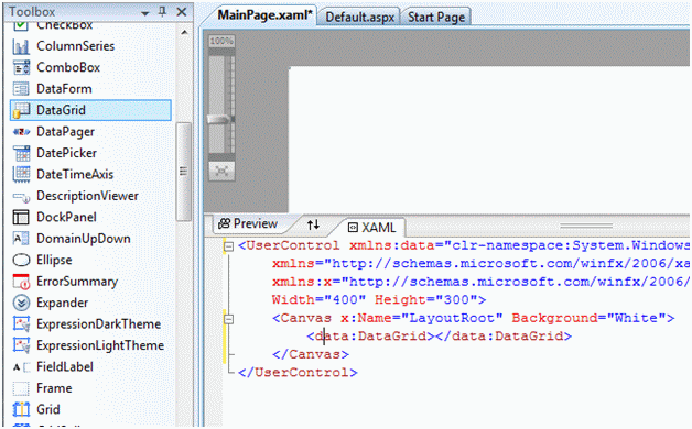
Another way to create a DataGrid control is by dragging a DataGrid control from Toolbox to the XAML code in Visual Studio XAML editor. Once you drag and drop a DataGrid control to the XAML page, you will see the following namespace reference is added to the XAML code.
xmlns:data="clr-namespace:System.Windows.Controls;assembly=System.Windows.Controls.Data"
And the following code is added to the XAML code for the DataGrid.
<data:DataGrid></data:DataGrid>
Figure 1 shows Toolbox and XAML code preview after a DataGrid is added to a page.
Data Binding
The ItemSource property of DataGrid is the key to data binding. You can bind any data source that implements IEnuemerable. Each row in the DataGrid is bound to an object in the data source and each column in the DataGrid is bound to a property of the data source objects.
Listing 1 sets the ItemsSource property of a DataGrid to an array of strings.
public MainPage() {
InitializeComponent();
McDataGrid.ItemsSource = LoadStringData();
}
/// <summary>
/// Load a string collection
/// </summary>
/// <returns></returns>
private string[] LoadStringData() {
return "One Two Three Four Five Six Seven Eight".Split();
}
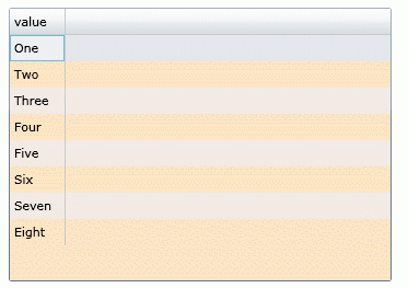
Figure 2 is the result of Listing 1. As you may see from Listing 1, the default column of the DataGrid shows all the strings in the array.
This was a simple example. Now let's build a little complex example.
ItemsSource and Data Binding
In this example, we will create a collection of objects and bind it to a DataGrid control.
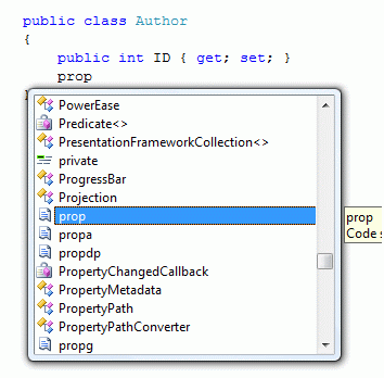
First, we are going to add a class to the project. Right click on the project, select Add New Item and select Class. I give my class name Author.cs. After that, we are going to add some public properties to the class. The simplest way to add a property to a class is type "prop" and hit TAB twice. This action will add an automatic property to the class. See Figure 3.
The final Author class looks like Listing 2.
public class Author {
public int ID {
get;
set;
}
public string Name {
get;
set;
}
public DateTime DOB {
get;
set;
}
public string BookTitle {
get;
set;
}
public bool IsMVP {
get;
set;
}
}
Now let's create a collection of Author objects by using the List class. The LoadCollectionData method in Listing 3 creates a List of Author objects.
/// <summary>
/// List of Authors
/// </summary>
/// <returns></returns>
private List<Author> LoadCollectionData()
{
List<Author> authors = new List<Author>();
authors.Add(new Author(){
ID = 101,
Name = "Peter",
BookTitle = "Graphics Programming with GDI+",
DOB = new DateTime(1975, 2, 23),
IsMVP = false });
authors.Add(new Author()
{
ID = 201,
Name = "Scott",
BookTitle = "Programming C#",
DOB = new DateTime(1982, 4, 12),
IsMVP = true
});
authors.Add(new Author()
{
ID = 244,
Name = "Mark",
BookTitle = "LINQ in Vista",
DOB = new DateTime(1985, 9, 11),
IsMVP = true
});
return authors;
}
The following code snippet sets the ItemsSource property of a DataGrid to List of Authors.
McDataGrid.ItemsSource = LoadCollectionData();
The new DataGrid looks like Figure 4, which shows the properties of the Author class column names.
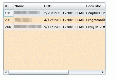
As you saw in Figure 4, all public properties of the Author object are represented as columns of the DataGrid. This is because by default, the AutoGenerateColumns property of DataGrid is true. If you do not wish to generate automatic columns, you simply need to set this property to false.
McDataGrid.AutoGenerateColumns = false;
Setting Column Width and Row Height
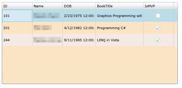
The ColumnWidth and RowHeight properties of DataGrid are used to set the default column width and row height of DataGrid columns and rows.
The following code snippet sets column width and row height to 100 and 40 respectively.
<data:DataGrid x:Name="McDataGrid" Width="580" Height="270"
Margin="10,10,0,0" Background="Bisque"
ColumnWidth="100" RowHeight="40">
</data:DataGrid>
The new DataGrid looks like Figure 5.
The MaxWidth and MaxHeight properties represent the maximum width and maximum height of a DataGrid. The MinWidth and MinHeight properties represent the minimum width and maximum height of a DataGrid. The MaxColumnWidth and MinColumnWidth properties represent the maximum width and minimum width of columns in a DataGrid.
Grid Lines Visibility and Header Visibility
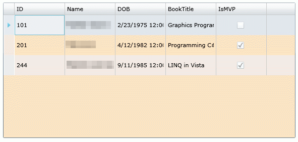
The GridLinesVisibility property is used to make gridlines visible. Using this option you can show and hide vertical, horizontal, all, or none lines. The HeaderVisibility property is used to show and hide row and column headers.
The following code snippet makes vertical grid lines visible and header visible for both rows and columns.
GridLinesVisibility="Vertical" HeadersVisibility="All"
The new DataGrid looks like Figure 6.
Grid Background, Row Background, and Alternative Row Background
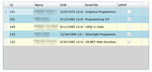
The Background property is used to set the background color of the DataGrid. The RowBackground and AlternativeRowBackground properties are used to set the background color of rows and alternative of the DataGrid.
The following code snippet sets the background, row background, and alternative row background colors of a DataGrid.
Background="LightGray" RowBackground="LightYellow"
AlternatingRowBackground="LightBlue"
The new DataGrid looks like Figure 7.
Border Color and Thickness
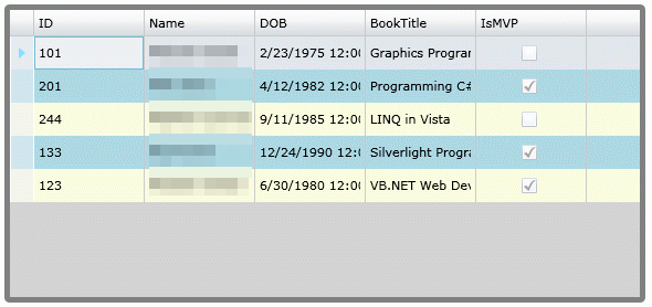
The BorderBrush and BorderThickness properties are used to set the color and width of the border. The following code snippet sets border color to gray and thickness to 5.
BorderBrush="Gray" BorderThickness="5"
The DataGrid with a new border looks like Figure 8.
Sorting
By default, column sorting is enabled on a DataGrid. You can sort a column by simply clicking on the column header. You may disable this feature by setting CanUserSortColumns property to false. The following code snippet sets CanUserSortColumns properties to false.
CanUserSortColumns = "False"
Scrolling
The HorizontalScrollBarVisibility and VerticalScrollBarVisibility properties of type ScrollBarVisibility enumeration control the horizontal and vertical scrollbars of the DataGrid. It has four values - Auto, Disabled, Hidden, and Visible. The default value of these properties is Auto, that means, when scrolling is needed, you will see it, otherwise it will be hidden.
The following code snippet enables horizontal and vertical scrollbars.
HorizontalScrollBarVisibility="Visible"
VerticalScrollBarVisibility="Visible"
The DataGrid with both scrollbars looks like Figure 9.
